Your browser was unable to load all of the resources. They may have been blocked by your firewall, proxy or browser configuration.
Press Ctrl+F5 or Ctrl+Shift+R to have your browser try again.

Color scheme of QB10 web interface for builds preferred for QB 11 and later #4424

tomz ·

Most of our teams' build users prefer the QB10 color scheme for build step display. The new scheme does make it harder to see which step is the deepest at-fault step inside nested composite steps. Would it be possible to get the old color scheme back? Would it be difficult to add a feature to be able to configure the color scheme?

thanks,
tomz

  • replies 14
  • views 361
  • stars 0
steveluo ADMIN ·

Hi tomz,

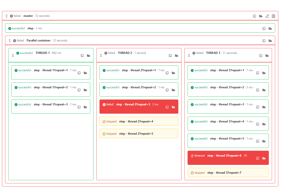
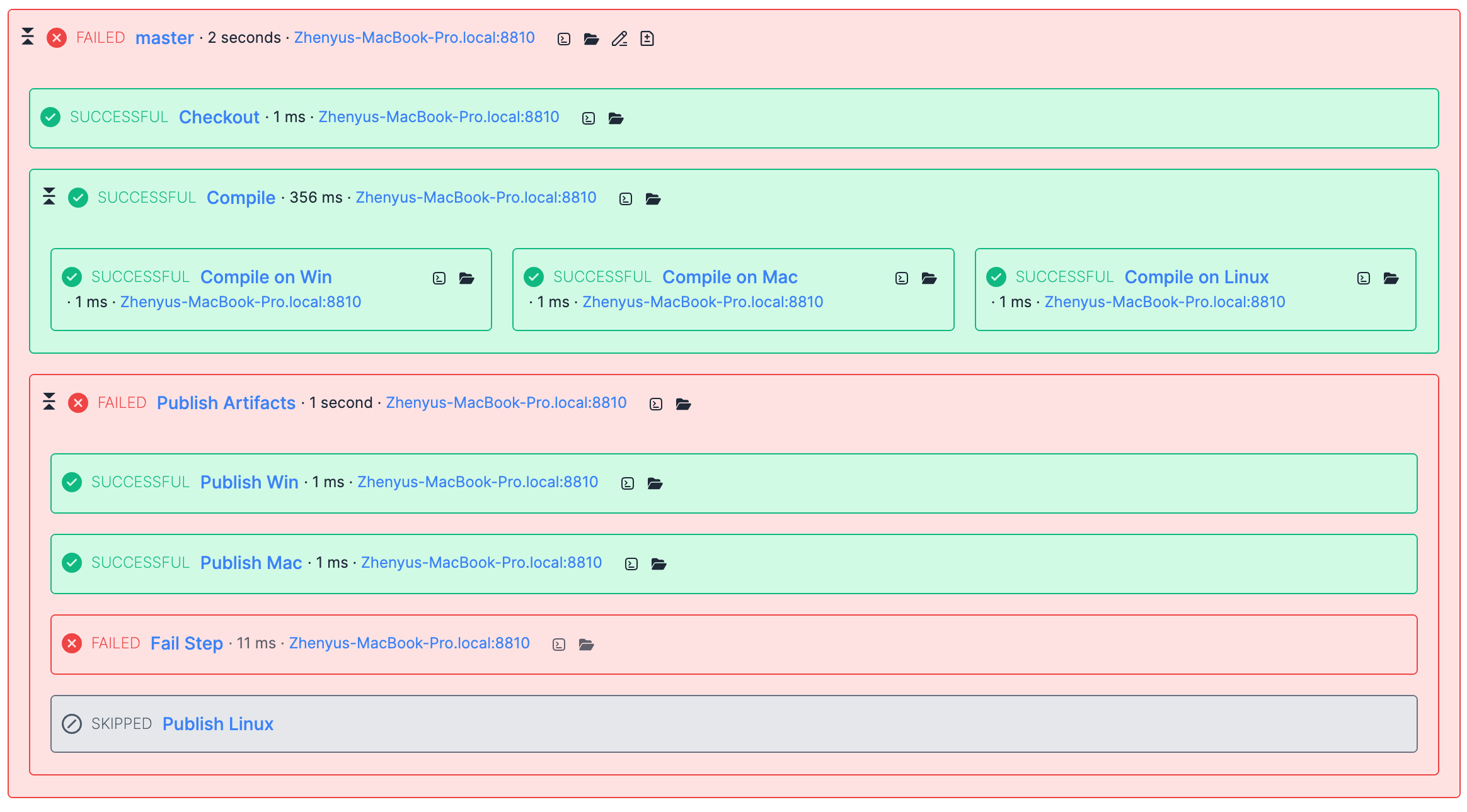
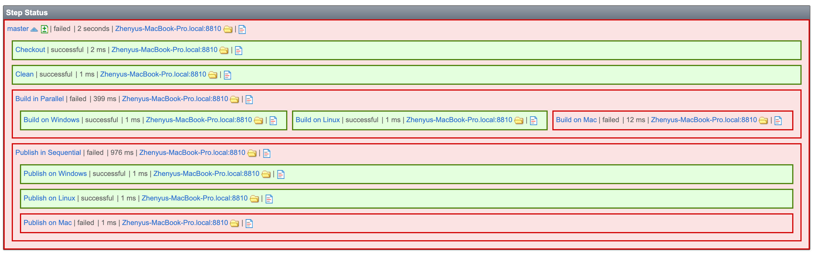
Before QB11, the steps graph looked like below:

old-ui.png

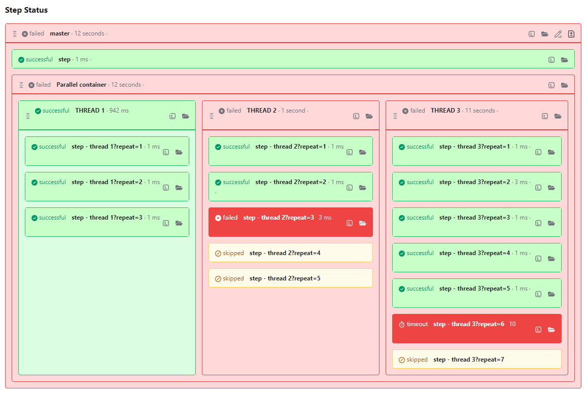
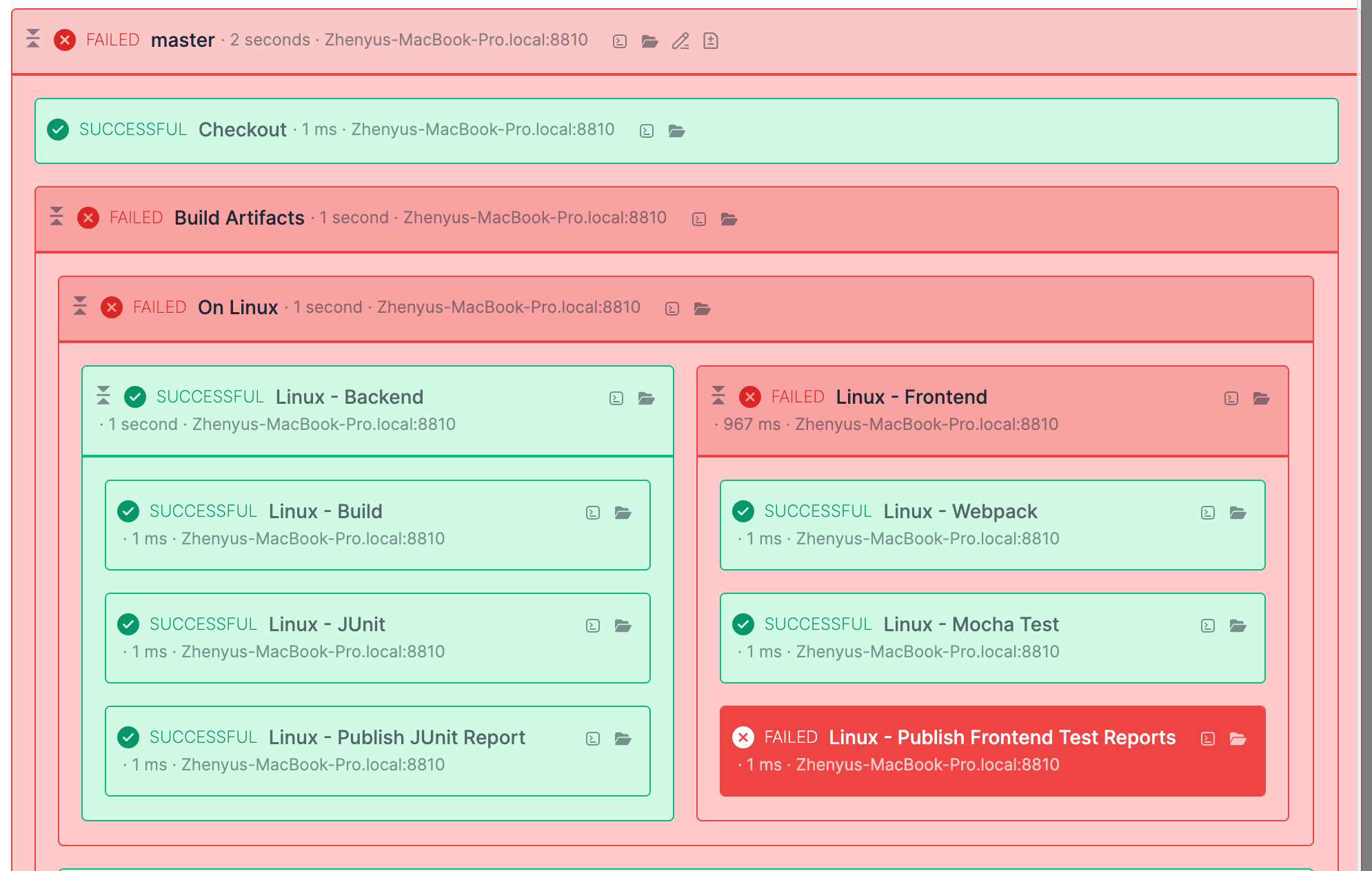
Since QB11, we highlight the failed steps only like below:

current-ui.png

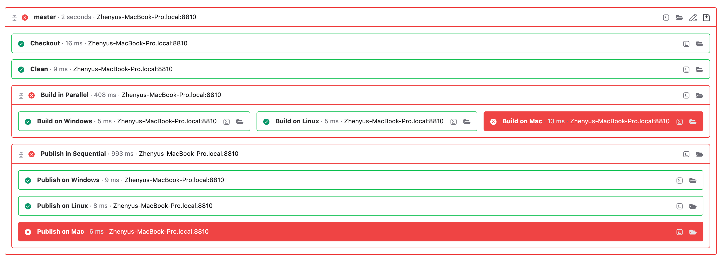
The new design gives more focus on those failed steps instead of composite steps and successful steps. It's easier to know which steps cause the build fail. While from our old design, it was easier to know which steps were successful, not the failed steps. They, the failed steps, have the same background color as the master step. From my point, the new design should be easier to find the failures. So, I think maybe you have already been used to the old design.

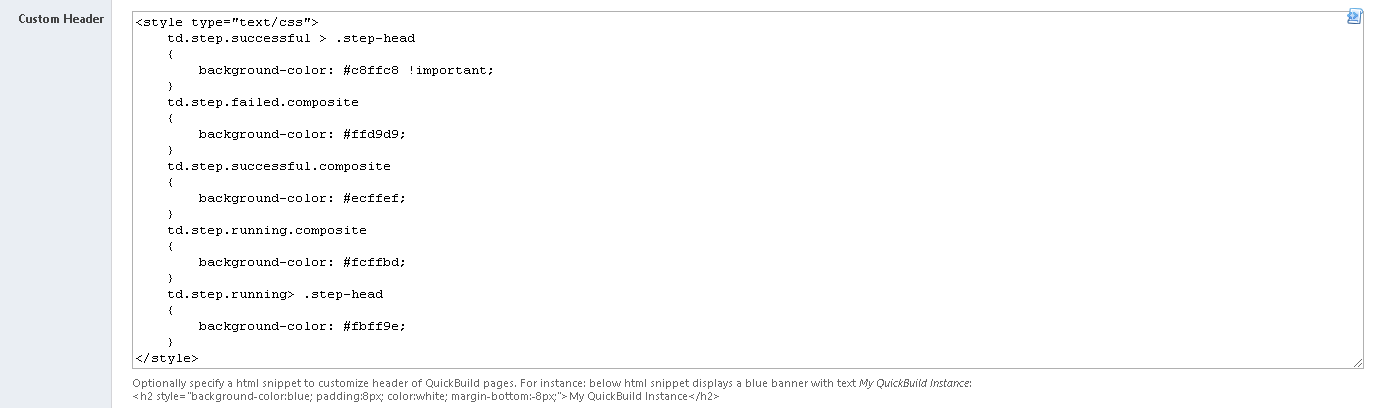
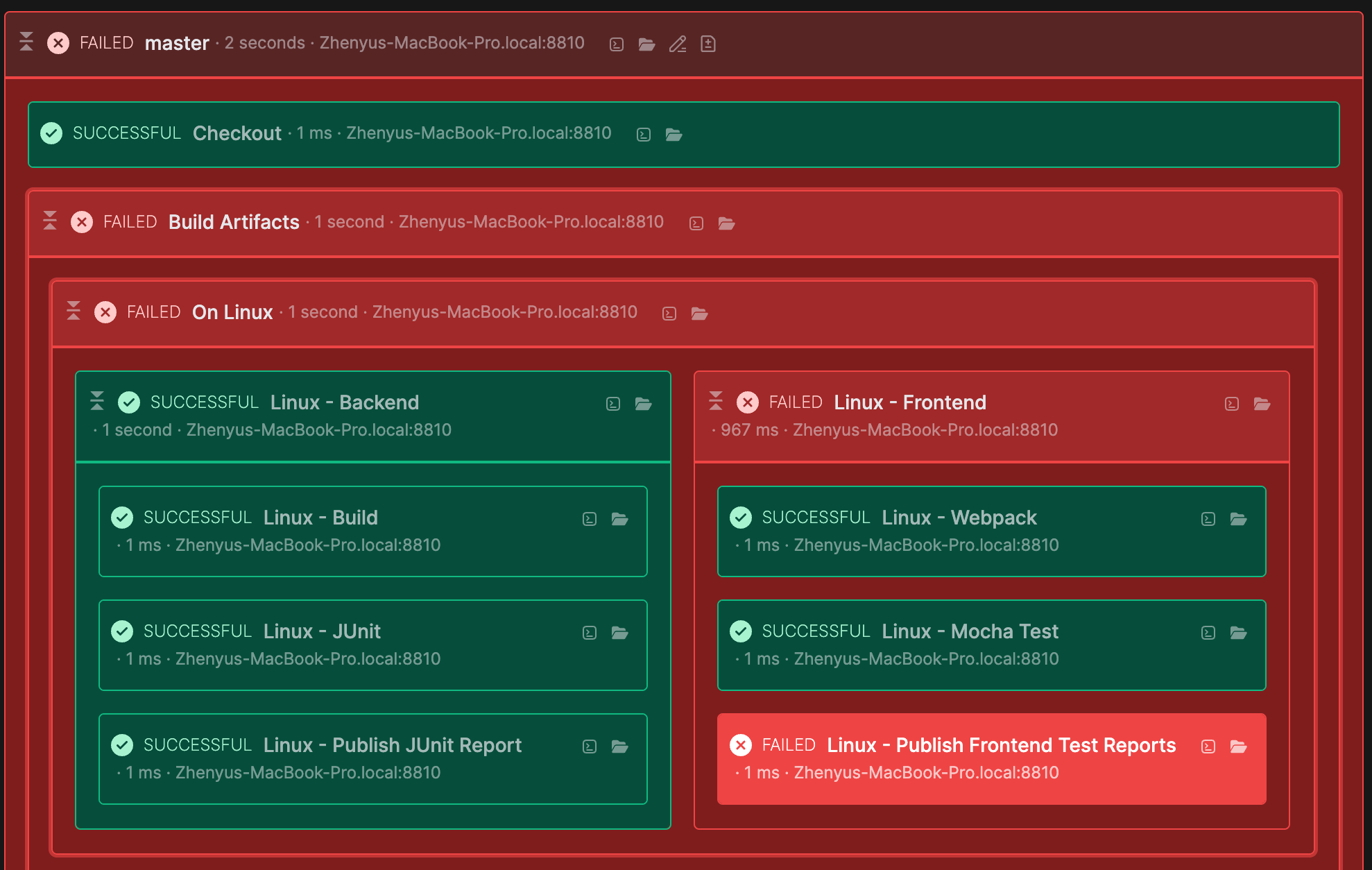
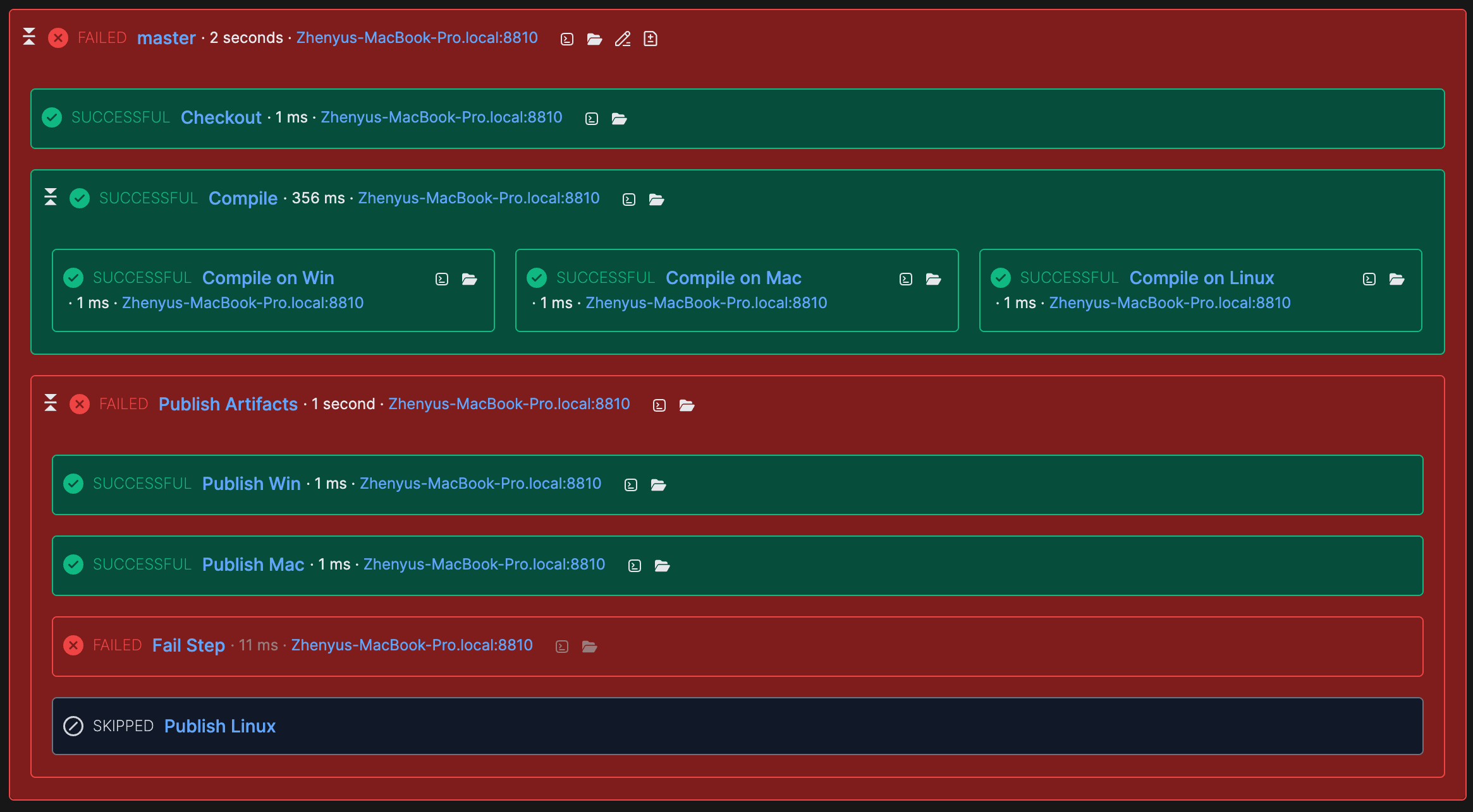
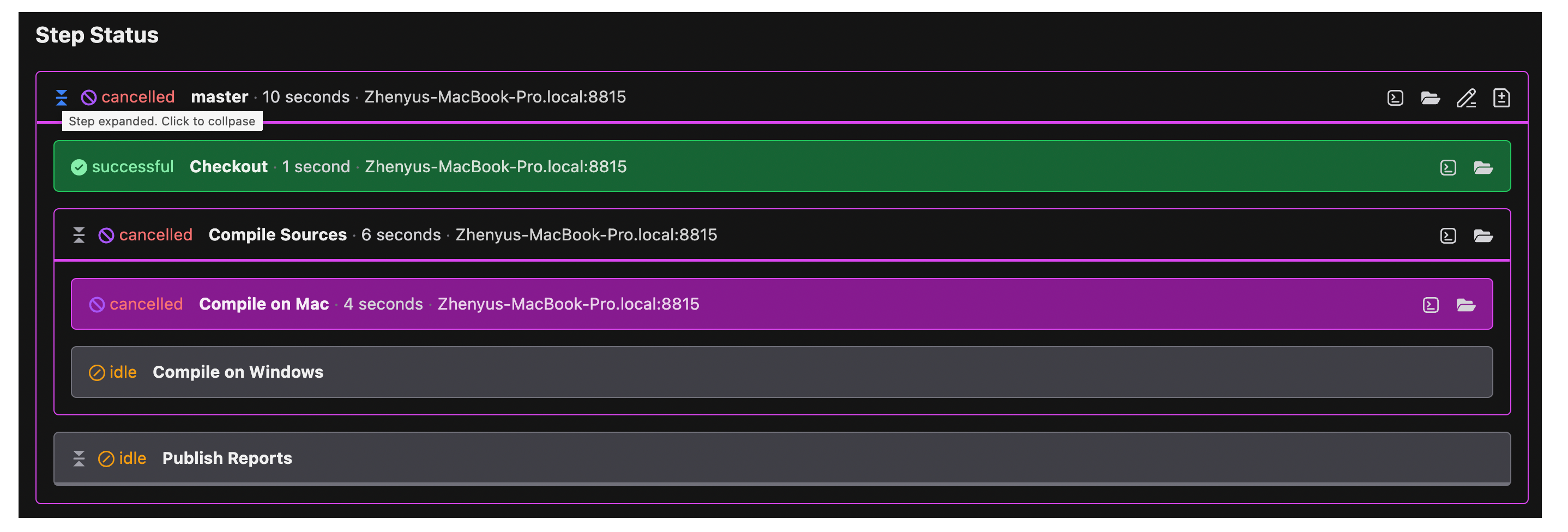
Anyway, supporting color scheme is now one of our the highest priority tasks. And we'll add it in next big release. So, please just give us a little patience. We're now working hard on this. It do have more work to do than we thought, we almost need rewrite the whole UI system (especially for CSS part and HTML part). Below shows a possible future steps graph in dark mode:

future-ui.png

Let me know what do you think, especially for color scheme support.

tomz ·

I'm really liking the dark mode. I think The major issue with the current color schema is that it's too white, and you can't really use browser themes to set it darker. Thanks for letting me know that the color scheme is a work-in-progress. To me, the ideal would probably be a combination of the old one and the new one (light-fill for all steps, but a dark solid-red fill for only the error steps). Looking forward to this feature, thanks again!

tz

sebastien.floch ·

We faced the same remarks from our main users after migrating our server from v10 to v12.
We managed to retrieve a similar color scheme using the option "Custom Header" from the "Administration" Tab > System Setting

We added this custom style :

<style type="text/css">
	td.step.successful > .step-head 
	{
		background-color: #c8ffc8 !important;
	}
	td.step.failed.composite 
	{
		background-color: #ffd9d9;
	}
	td.step.successful.composite 
	{
		background-color: #ecffef;
	}
	td.step.running.composite 
	{
		background-color: #fcffbd;
	}
	td.step.running> .step-head 
	{
		background-color: #fbff9e;
	}  
</style>

QB12 original style
QB12_original_style.png

QB10 like style
QB12_custom_style.png

drdt ·

Sebastian, can you give more details on this? I tried just pasting in your code, but it doesn't have the desired effect.

sebastien.floch ·

Hi, this code should works as it is. We only have that in our server custom header. At this moment we use Quickbuild server version 12.0.12. Not tested with another Quickbuild server version.

Custom_header_QB10_colors.png
drdt ·

I finally got this to work, I had problems with the copy/paste of your code; formatting matters.

I was able to do this alongside my own custom header:

<h2 style="background-color:blue; padding:8px; color:white; margin-bottom:-8px;">Development Instance</h2>
<style type="text/css">td.step.successful > .step-head 
    { background-color: #c8ffc8 !important; }
    td.step.failed.composite { background-color: #ffd9d9; }
    etc.
drdt ·

Alas, it looks like this no longer works in v13. Is there a way to do this using the new CSS functionality in v13?

sebastien.floch ·
steveluo ADMIN ·

Hi@drdt

As@sebastien.floch mentioned, since QB 13, you needn't hack "Custom Header" to do the customization, instead, you are encouraged to use "CSS Customization" which is dedicated for this.

drdt ·

Thanks, I have been trying this, but the instructions are very sparse. I see one example on the whats-new page, but I can't find any list of what the available options are. Am I missing something?

robinshen ADMIN ·

@drdt custom css will be the last to be applied in the page, and you may check page css rules with browser page inspection tools and override them as necessary. Please try it and let us know what we can improve here.

drdt ·

Thanks, I am trying to do this, but when I open up the page inspection tools, what I see there looks like messages from the stars. Can you give an example perhaps? I also tried the document linked off the what's new page, but as a non-web-develoer, it may take some weeks of study to understand it.

Can you give an example of where to find a setting that I might override, and how to change it?

robinshen ADMIN ·

I recorded a demo and sent you an email. Please check it.

steveluo ADMIN ·

Hi, I added a simple guide on how to do CSS customization in our wiki and I hope it can help:

I also notice that some of you are interested in using the old step graph. So, below I'll show you some code on adding color to the step graph:

.dark .step-graph.step-runtime .step.successful {
	--step-head-bg: var(--qb-color-green-900);
	--step-head-bg-opacity: 1;
	--step-body-bg: var(--qb-color-green-900);
	--step-body-bg-opacity: 1;
	--step-icon-color: var(--qb-color-green-200);
}

.dark .step-graph.step-runtime .step.timeout {
    --step-head-bg: var(--qb-color-orange-900);
    --step-head-bg-opacity: 1;
    --step-body-bg: var(--qb-color-orange-900);
    --step-body-bg-opacity: 1;
    --step-icon-color: var(--qb-color-orange-200);
}

/* ... custom your other step status colors */

.dark .step-graph.step-runtime .step.composite.failed {
	--step-body-bg-opacity: 1;
	--step-body-bg: var(--qb-color-red-900);
	--step-icon-color: var(--qb-color-red-200);
}

after doing so, you will see the step body colors like below in dark theme:

steps.png

If you also want to show them in light mode, then just add your light mode css:

.light .step-graph.step-runtime .step.successful {
	--step-head-bg: var(--qb-color-green-100);
	--step-head-bg-opacity: 1;
	--step-body-bg: var(--qb-color-green-100);
	--step-body-bg-opacity: 1;
	--step-icon-color: var(--qb-color-green-600);
}

.light .step-graph.step-runtime .step.timeout {
    --step-head-bg: var(--qb-color-orange-100);
    --step-head-bg-opacity: 1;
    --step-body-bg: var(--qb-color-orange-100);
    --step-body-bg-opacity: 1;
    --step-icon-color: var(--qb-color-orange-600);
}

/* ... custom your other step status colors */

.light .step-graph.step-runtime .step.composite.failed {
	--step-body-bg-opacity: 1;
	--step-body-bg: var(--qb-color-red-200);
	--step-icon-color: var(--qb-color-red-600);
}

and it looks like below:

step-light.png