Hi tomz,
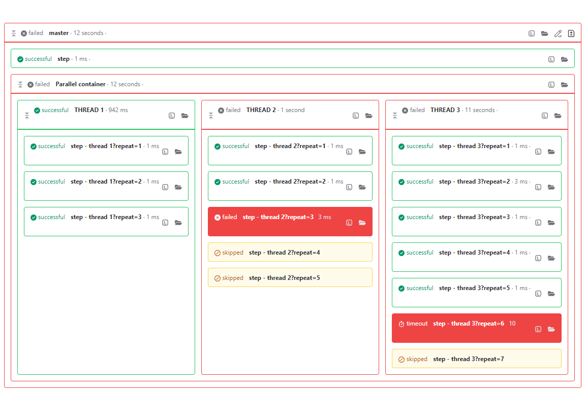
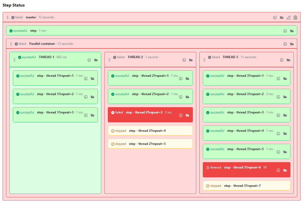
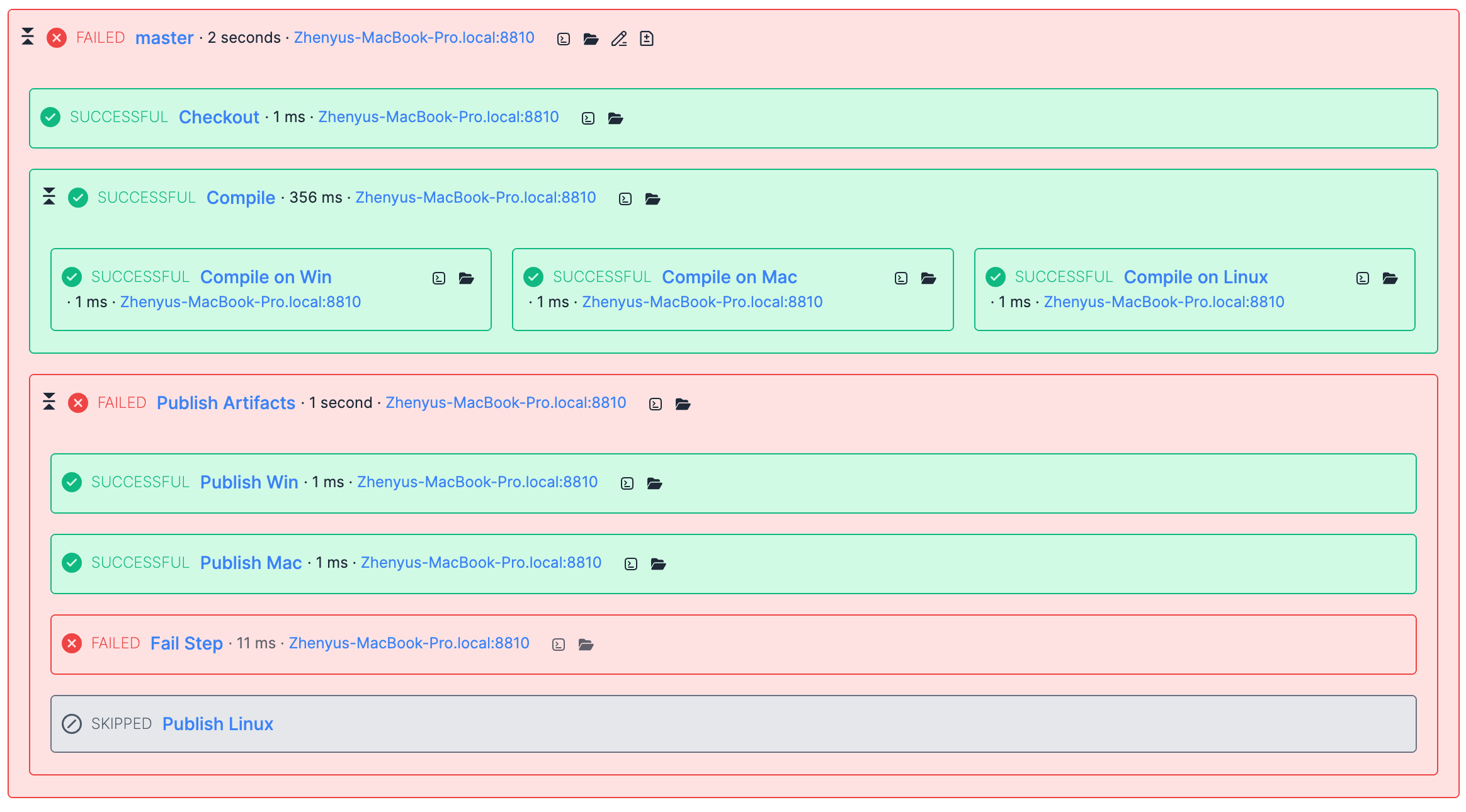
Before QB11, the steps graph looked like below:

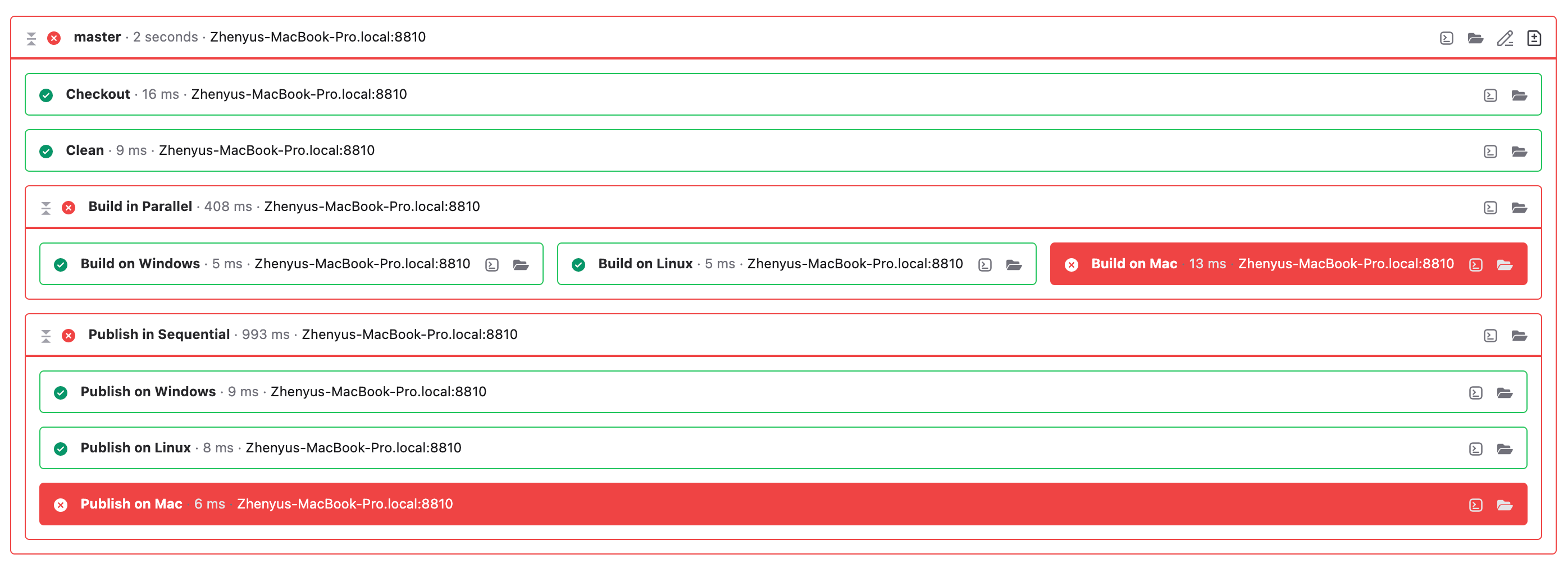
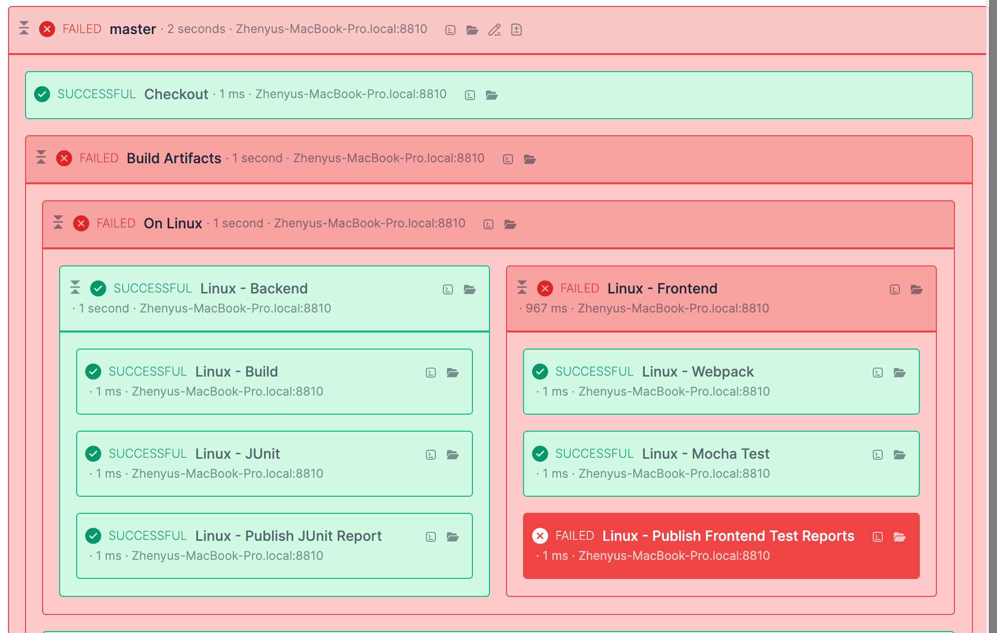
Since QB11, we highlight the failed steps only like below:

The new design gives more focus on those failed steps instead of composite steps and successful steps. It's easier to know which steps cause the build fail. While from our old design, it was easier to know which steps were successful, not the failed steps. They, the failed steps, have the same background color as the master step. From my point, the new design should be easier to find the failures. So, I think maybe you have already been used to the old design.
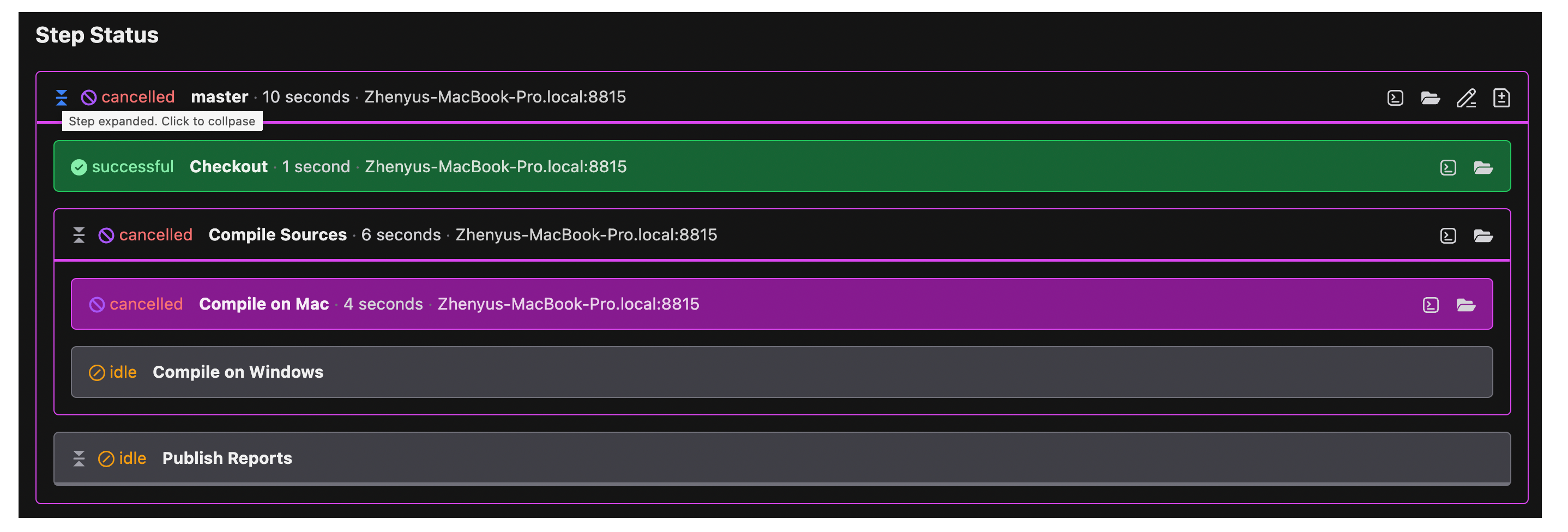
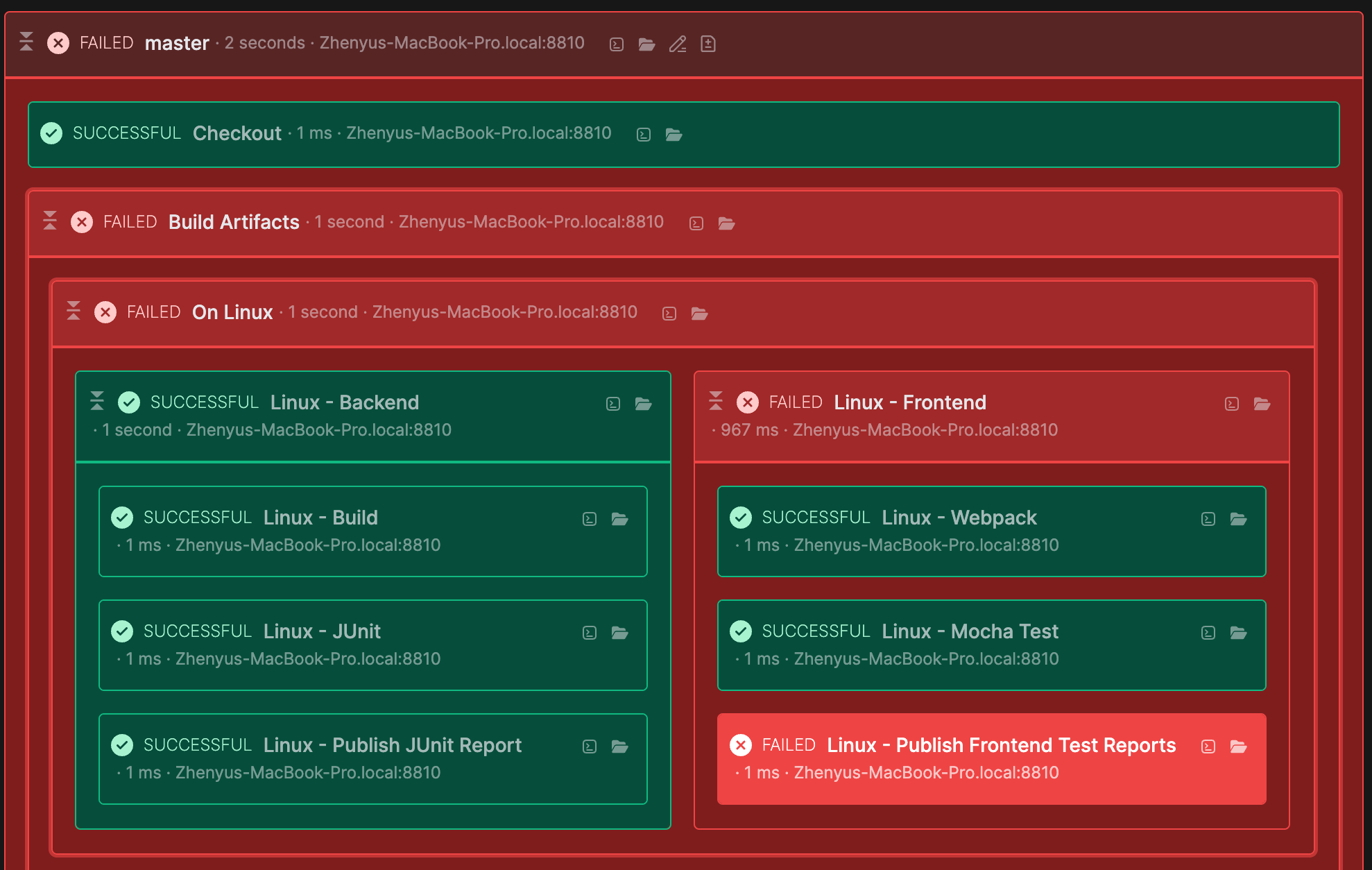
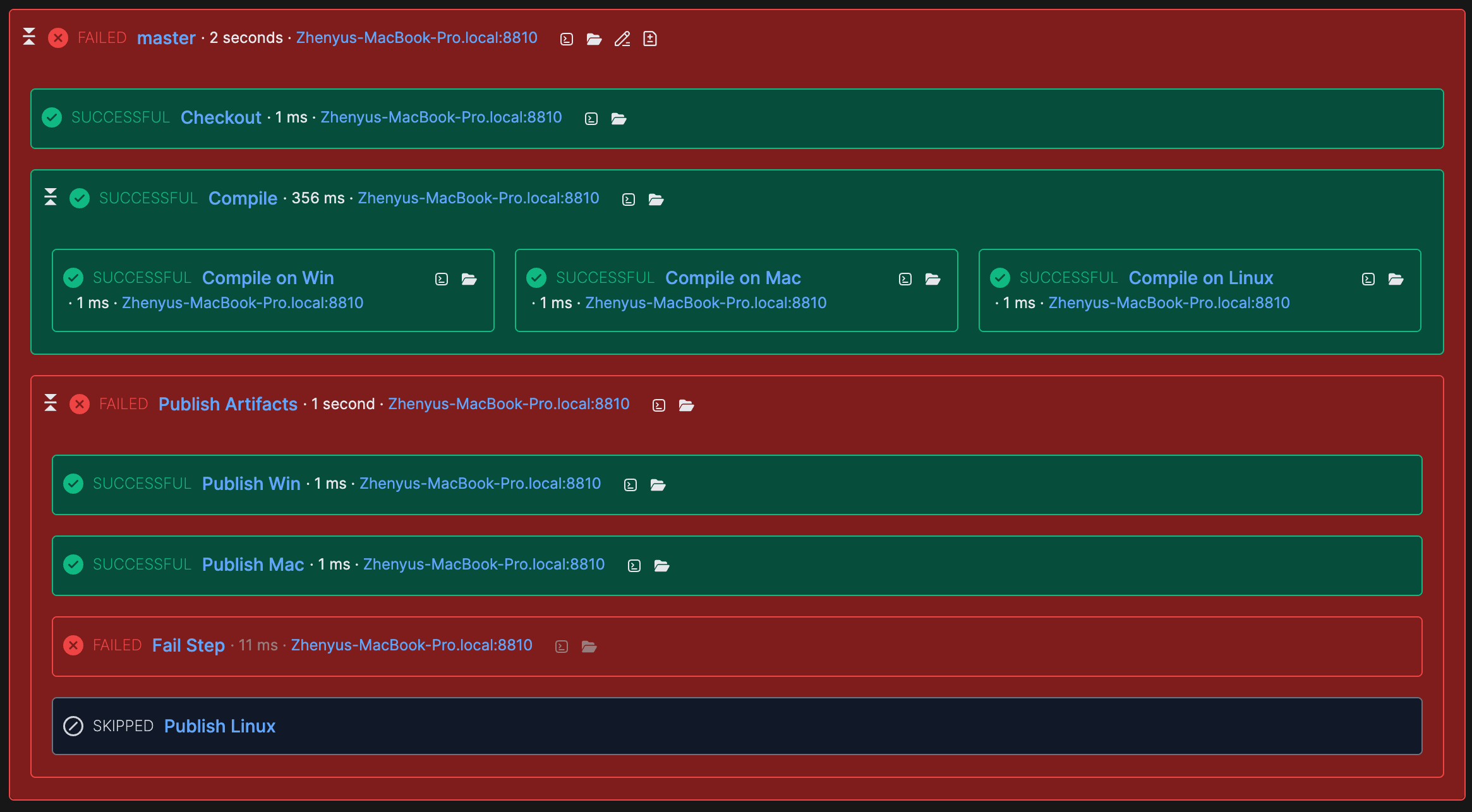
Anyway, supporting color scheme is now one of our the highest priority tasks. And we'll add it in next big release. So, please just give us a little patience. We're now working hard on this. It do have more work to do than we thought, we almost need rewrite the whole UI system (especially for CSS part and HTML part). Below shows a possible future steps graph in dark mode:

Let me know what do you think, especially for color scheme support.


